Improving the navigation of a carbon accounting Software as a Service website.
ClimaTech Innovations LLC.
Length of project: 4 weeks
Size of team: 4
My role: UX Researcher
Overview
Who is ClimaTech?
ClimaTech Innovations LLC is a carbon accounting firm. They consult with companies and provide solutions to lower or offset carbon emissions.
The Problem
How Might We bring clarity and focus to the dashboard so that users can understand the website better?
Design Process
Strategy
-
To better understand the needs of our stakeholders and to gain insights for redesigning ClimaTech’s website we conducted initial interviews with them.
-
Walk us through what you offer your clients? How do you calculate their carbon footprint? How does a typical consultation look like?
What information do your clients find most useful in understanding their carbon footprint?
How do your clients currently interact with the software you're providing?
What is the feedback you receive from them? What do they like about your services? What do they find challenging about it?
What is the primary goal you want your clients to achieve from the overall experience?
How many clients do you work with and would they be willing to meet with one of us so that we can learn what they are needing from the experience as well?
-
Redesign CTI’s SaaS website from end-to-end.
Create a user flow that is easy to navigate by matching between the system and the real world.
Redesign the dashboard with consistency and standards.
Create relevant interfaces with aesthetic and minimalist design.
-
The goal of the research phase was to interview with ClimaTech’s clients. We wanted to gain a better understanding of how their clients engage with complex data. Due to business constraints we were not able to carry out user interviews. Here is a link to the proposed research plan.
Discovery
Understanding the website
After a comprehensive audit of ClimaTech’s preliminary designs, we learned this.
We needed to use consistent color and UI elements that meet market standards.
We needed to minimize information so that users have clear expectations of how to navigate the website.
We needed to discover a user flow that mimics a filing system.
Understanding the market
An in-depth competitive analysis was conducted resulting in design opportunities.
Plan A
Takeaway: Visual elements with supportive text Greenly
Takeaway: Branded and cohesive UI Net Zero Cloud
Takeaway: Incorporate color in graphs and chartsPersefoni
Takeaway: Use standard fontsDesign
Site Map
After considering the business direction we mapped out the taxonomy with controlled vocabulary.
Style Guide
Typography
Colors
Icons
We wanted to conduct usability testing with ClimaTech’s current clients, however, business constraints limited our ability to do so. We needed to think outside of the box. I advocated testing our mid-fidelity prototype with our stakeholders.
Iterate
Usability Testing
Testing with our client—ClimaTech’s CEOs- we got a well-rounded viewpoint for designing. This also allowed the CEOs to step into their clients’ shoes creating more design clarity.
-
View the test script here
-
Task 1: I’d like you to commit to a task that may help reduce your company's carbon footprint. Through the website how would you commit to that task?
How would you support your team in lowering their transportation emissions?
What would you need to support you in completing this task?
First Test Results
The dashboard was cluttered and hard to read.
No measure flow- we needed to create a space for users to track and upload new data to account for carbon emissions.
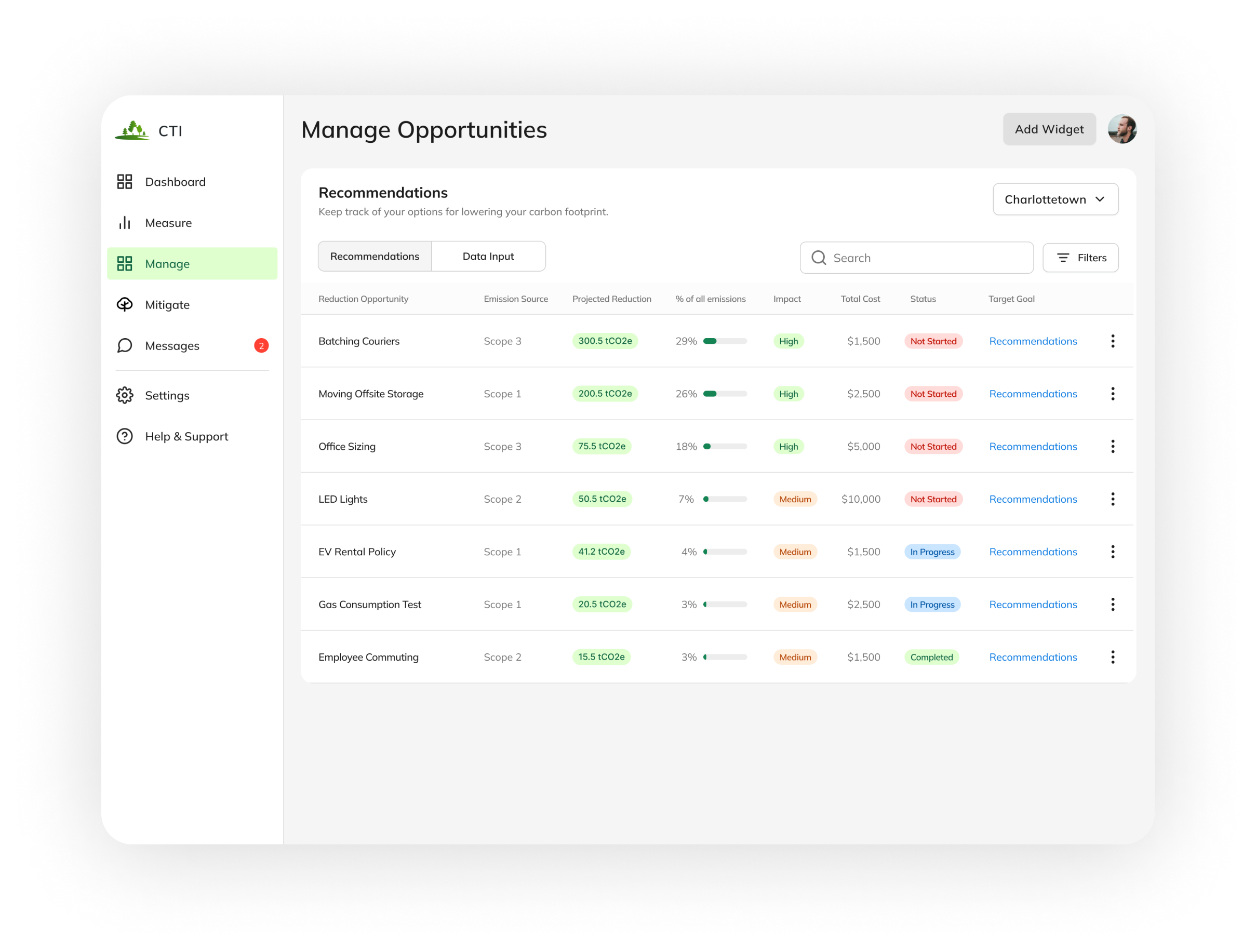
The language was confusing. ”Manage opportunities” made more sense here.
Usability Issues
I communicated changes with the designer by prioritizing each issue. We were able to efficiently correct issues and meet our 4-week deadline.
Second Test Results
Visual hierarchy needed adjustments. The “add widget” button was too heavy, users need to know what city they are looking at.
Status tags needed to change from “high/low” to “not started/in progress/complete”
Not enough motivation to purchase trees because there was no call to action button.
Final Test Results
We validated our designs by testing with people outside of the ClimaTech network. Here are the insights we discovered.
Final Design
Consistency and standards
Flexible and efficient dashboard that’s easy to navigate
Matching between the system and the real world
Businesses can manage tasks and data within one screen, similar to industry filing systems.
Users can learn more about the recommendations CTI suggests
Aesthetic and minimalist design
At a glance, users can understand their company’s complex environmental data
Prototype
Takeaways
What I learned
It pays off to think outside the box
By testing with our clients (the founders of CTI), we were able to have a holistic point of view of the design.
User’s responded to a dashboard with a few elements to help them navigate their climate accounting journey.
Keep it simple silly
What I would do next
I am curious about how to educate users throughout their onboarding process.
How can we support users in comparing costs so they have more control over reaching their target goals?
Conduct more usability testing


